Service Installations and Upgrades Portal (SIUP)
Modernizing form content and architecture for an expedited, user-friendly utility experience.


At a glance

Summary
Exelon’s New Business Portal (later called the Service Installations and Upgrades Portal [SIUP]) is the supplier onboarding and registration system for all Exelon utility clients.
These users are interested in installing new gas or electric services either on their behalf or that of a client’s.
My roles
Content strategist and designer, Information architect
Collaborated with
-
Product Managers (1)
-
Product Designers (2)
-
Content Designers (1)
-
Exelon SMEs and Business Owners (5+)
Highlights
-
Content systems evaluated and audited at scale
-
Compliance-heavy technical content translated into plain language
-
Taxonomies and naming conventions that unify internal and external communication
-
Leadership partnership to drive adoption of content standards
-
Tactical execution balanced with long-term governance frameworks
Duration
Aug 2024 to Dec 2024 (4 months)
Impact
-
Identified 43% of non-user friendly content to be retired or consolidated.
-
Reduced user task time spent trying to locate the portal by 18%
Problems
-
Inconsistent voice, tone, and language across forms
-
Heavy reliance on technical jargon inaccessible to non-specialists
-
Poorly labeled CTAs and links creating navigation friction
-
Overuse of tooltips to deliver dense instructions
-
Accessibility gaps (inaccessible PDFs, missing alt text, lack of plain language)
-
Existing content style guide not consistently implemented
Solutions and process
-
Conducted a comprehensive content audit of 39 application pages
-
Redesigned information architecture for improved navigation
-
Proposed improved portal entry paths and homepage tiles for clearer user journeys
-
Created taxonomy of New Business terms to align internal teams and reduce confusion
-
Integrated existing content style guide into workflows for consistency
Content heuristic evaluation
Forms audit
As part of my content audit, I performed a heuristic evaluation on our most popular application for New Business services, simply called the "Commercial & Industrial Application."
Each page of the application was evaluated based on 7 content heuristics.
This application had 39 pages in total, all of which were analyzed and evaluated on a scale from 0-10 for a total of 390 possible points.

Audit results
Ultimately, this application scored a 53% (209/390 points), meaning it “meets expectations” but just barely. Obviously there were lots of opportunities for improvement!
My team and I presented the following issues and action items to Exelon Business Owners, making clear there was a need to improve the language and information architecture of the current online application process.


Post-audit impact
Ultimately, through this audit, I identified 43% of non-user friendly content to be retired or consolidated.
The full application heuristic evaluation can be viewed here.
Portal navigation and IA
Language-guided paths to the portal
Continuing my content audit of New Business content, I performed a language-guided evaluation of various paths to the portal, all of which start on each Exelon subsidiary homepage.
Ultimately, I uncovered 3 paths to the portal, none of which were particularly intuitive from a language perspective.

.png)
New path proposal
Using the following decision tree, I proposed a new path to the portal that cut down on user actions and provided more explicit, direct language relating to the task at hand.


New path UI mockups - Homepage
For this new path, I also crafted lofi designs which proposed we add a new "Construction & Remodeling" (referred to internally as "New Business") tile to homepage of each Exelon subsidiary.
Homepage - Before and after


New path UI mockups - "Stop Start Move"
All Exelon utility sites had a page for customers wanting to start, stop, or move an existing electric/gas service (relatably titled “Start Stop Move”). I also proposed adding a “Construction & Remodeling” tile to this page, since the services offered were quite similar.
Earlier research had even indicated many Exelon users didn’t see a difference between installation of new services vs making alterations to existing ones.
"Stop Start Move" - Before and after


Usability testing impact
This new IA reduced user task time spent trying to locate the New Business portal by 18%
New Business taxonomy
Context
We had a lot of forms, technical jargon, and taxonomy that was specific to Exelon and its subsidiaries. Internal team discussions were frequently filled with confusion, since not all of the subsidiaries used the same naming convention standards.
As seen below, ComEd’s “Modification & Relocation” application is the same as BGE’s “Residential (Increase/Relocation)” application, but they go by different names.
To further complicate matters, lots of us who had just come on the project weren’t familiar with any of these terms to begin with.

Solutions and process
To help teams become better acquainted with Exelon nomenclature, minimize frustration, and keep stakeholder discussions from veering off track, I created and socialized a taxonomy that:
-
Categorized New Business Terms by their use across all related contexts (Applications, Portal, Construction & Installation Site Page, Service Type (gas, electric, solar power)
-
Defined all terms succinctly
-
Identified any terms by which naming conventions differed across subsidiaries


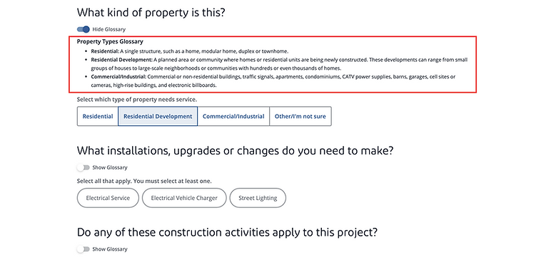
New form glossary
Many of these definitions were later recycled and used for an improved tool tip experience, where users could select a "Show Glossary" drop down to better understand form requirements.