Cerebral style guide
Bringing language, tone and voice, and terminology consistency to all Cerebral content


At a glance
Challenge
When I joined Cerebral in late 2021, the company had no centralized content style guide. Teams were using outdated, inconsistent language spread across multiple systems, including CMS platforms (Iterable, Zendesk, Contentful), Google Docs, and Figma.
This fragmentation created confusion and friction between teams, as there were multiple “sources of truth” referenced to write copy.
Additionally, the telehealth industry as a whole was growing at a rapid rate. This meant that new laws and HIPAA-related regulations were being constantly implemented that effected the way Cerebral communicates with its users.
My roles
-
UX Writer
-
Content Manager
-
Technical Writer
Collaborated with
-
Design
-
Product
-
Legal
-
Marketing
-
Clinical Leadership

Solution
I created a unified, clinically sound, and inclusive brand voice that would ensure clarity and trust across all user touch points, including product, marketing, support, and clinical communications.
Duration
Oct 2021 to Apr 2023 (1 year, 7 months)
Impact
100% adoption across all channels.
Discovery and planning
Identifying who we're communicating with, and where
Cerebral's 3 primary users were:
-
Clients seeking mental health support
-
Clinicians (prescribers and therapists) providing care
-
Internal teams (care coordinators and support specialists) who communicated regularly with both groups
These users were found across multiple platform touch points, illustrated by the flow chart below:

User data and brand guidelines
Available data revealed clients represented the majority of Cerebral users, and were the group that was the most sensitive to tone and language in communication.
As such, I made the decision to craft our style guidelines primarily to cater to Cerebral clients, with voice, tone, and language preferences, flexing slightly for contexts where the majority readers were our other 2 user groups.


Outlining the style guide
Shortly after I came on, I met with a soon-to-be offboarded copywriter who had been in the process of building a rough outline for a would-be style guide.
We had a month of weekly 1:1's to determine what guidelines were currently in place that could be recycled or deprecated entirely. There was not much aside from some brief branding guidelines that mapped out a voice and tone for Cerebral.


Expanding existing guidelines
Since these voice and tone guidelines had already been vetted and approved by clinical leadership, who know Cerebral's majority user base best, we made the choice to keep these in essence while creating net-new guidelines for:
-
Grammar and formatting (sentence case, oxford comma use, numbers and dates, etc)
-
Language and taxonomy (terms to use and not use, how to write inclusively, etc)
-
Microcopy (CTAs, labels, error states)
-
Contextual use cases for tone shifts (ie, marketing copy vs. UX copy)
-
Instructional “dos” and “don’ts” for each guideline
Additionally, I made a note to expand upon our current voice and tone guidelines by:
-
Identifying and explaining the difference between the two (voice vs. tone)
-
Highlighting nuances where tone scales shift depending on the context (ie, social media ad copy vs. onboarded patient materials)
-
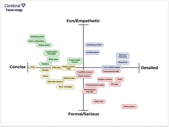
Work with other teams to develop a tone map, outlining specifically where each type of Cerebral content should fall (ie, marketing emails vs. white papers).
Word doc skeleton

Tone map
Style guide architecture


Research and insights
Summary
I conducted multi-source research to establish the foundation of Cerebral’s style guide.
The goal here was to identify language patterns and guidelines specifically to support our client user base.
Competitor research
I performed competitor research to identify common language patterns used across well-known, successful mental health telehealth platforms such as Talkspace, Brightside, and Betterhelp.
Insights
The more successful platforms tended to speak to clients in a warm, compassionate tone throughout all customer-facing contexts.
Special care was taken to explain each portion of the onboarding, helping clients understand why they were asking for sensitive details, such as their age or cultural background (ie, "knowing your age helps us match you with therapists who can best support clients at your life stage")
Conversation mining
Insights
I performed conversation mining of Cerebral user interviews to identify potential language and taxonomy preferences.
Common linguistic patterns included colloquial, emotionally neutral wording (e.g., “getting help,” “feeling better,” “talking with someone”) rather than technical diagnostic terms.
Language accessibility
Insights
I researched readily available guidance for language as a whole, such as WCAG and Plain Language Guidelines.
Guidelines emphasized that readability and clarity directly impact comprehension and inclusivity, especially for users in emotional distress. This validated the decision to prioritize short sentences, active voice, and concrete verbs.
It also guided the creation of grammar and formatting standards (ie, consistent use of sentence case, numerals, and descriptive link text) to ensure that content met accessibility standards as well as brand tone.
Inspiration
Insights
I looked to widely socialized and industry-accepted style guides for inspiration, such as those made by content teams at Microsoft, Mailchimp, and Atlassian.
These teams’ guides demonstrated the value of modular, principles-driven documentation rather than prescriptive rules. I adopted a similar approach by defining clear principles (“be direct,” “be compassionate,” “be inclusive”) and showing examples for varied contexts.
Content strategy and approach
Socializing the style guide
My earliest attempt to get stakeholder buy-in involved an instructional walkthrough of the guide (housed in Google Slides at the time) during a company All Hands.
This worked for making the rest of the company aware that these guidelines existed and should be utilized for all copy moving forward. However, there was still a need to develop a plan to ensure that the guidelines were actually followed.
To assist with this, I did the following:
-
Pinned the style guide to each appropriate Slack channel (Design, Marketing, Legal, Clinicians, Support)
-
Put aside 1 hour a week for office hours where anyone could come in with questions about content guidelines or who were looking for general writing tips
Generally speaking, most teams and leadership supported the rationale for these guidelines and did not raise much opposition. All of us knew that this was a much-needed change, and were happy to adopt it.
A bigger challenge that presented itself was that we still had reusable content assets teams were using that had not yet been updated to adhere to the guidelines.
Slides from the first style guide iteration


Auditing strings, templates, and other content types
One of the toughest parts of creating this style guide was identifying all of the different content management systems teams were using for reusable copy types and assets to audit. This included:
-
Email templates and SMS notifications (Located in Iterable and Zendesk)
-
Support scripts and messaging (Located in Google Docs and Contentful)
-
Marketing blurbs (Located in Google Docs and Zendesk)
-
UI Microcopy (Located in Figma)
I worked with my fellow designers, marketing leaders, product managers, and clinicians to gain access to these systems and audit as needed to ensure style guide adherence.
Some of my feedback on support scripts for frequently asked customer questions

Design system and styling updates
The majority of our frequently-used UI components involving copy were housed in Figma’s design system. One of the biggest updates that needed to be made is that these legacy components needed to be audited and edited to align with the new grammar and formatting guidelines.
Some of the biggest changes myself and the Design Ops lead focused on was:
-
Ensuring all strings used sentence case rather than title case
-
Making updates to commonly used terminology to reflect Plain Language best practices (ie, swapping out terms like “ensure” for “make sure”)
-
Making language and terminology updates that complied with ever-evolving legal and HIPAA guidelines for telehealth companies (ie, we could no longer refer to our clinicians as such in customer-facing copy, and all instances of this needed to be changed to “prescribers”)
I used a third-party Find and Replace Figma plugin to make this process for myself and our design leads a bit less time-consuming. That functionality was not natively supported by Figma at the time of this project.
Inconsistent (and incorrect) use of title case was one of the biggest challenges I tackled in unifying all UI microcopy

Microcopy components
I worked with each design lead across our 3 pillars, (Growth, Retention and EMR) to identify some of the most commonly used strings across the Cerebral platform.
I then designated the following categories for microcopy and included a definition, purpose, and instructions for use:
-
CTAs
-
Labels
-
Error states
-
Terms, conditions, and other “legalese”
-
Crisis-related
-
Contact us
-
Insurance
-
Memberships and payment
These component strings were given a designated page in Cerebral’s Figma design system file. I tagged each appropriately so that they could be easily accessed by design team members in Figma's asset panel.

Some pages from the microcopy component library


Other decisions and rationale
User-friendly documentation
I chose Zeroheight as the central documentation platform (an upgrade from Google Docs) to enable more seamless navigation, continuous updates, and collaboration with content owners across teams.
Ongoing team cross-collaboration
I worked with team stakeholders (product, legal, marketing, and clinical) to ensure legacy style guides were deprecated or updated, language and terminology stayed regulatory-compliant, and ensured regular communication through:
-
An async Slack channel created specifically to discuss style guide maintenance, and updates
-
Scheduled meetings as needed
Content-based UX research
I engaged in content-based UX research to justify guideline rationale and proposed updates. Some examples of this include:
-
Running comprehension surveys to identify preferred nomenclature and tone by clients currently experiencing mental health crises
-
Presenting results of these surveys to stakeholders to justify buy-in
-
Regularly taking part in UX research alongside the design team, incorporating content research methods to ensure decisions were validated (ie, tree testing in account flow tests, copy-based questions in usability interviews, A/B testing of SMS notifications that more closely utilize updated tone guidelines)
A portion of a research plan I wrote to measure user reactions to care role titles used at Cerebral

Impact and outcomes
🎯 Stakeholder adoption
🎯 Reusable components
The new content system achieved 100 percent adoption across design, marketing, clinical, and support teams.
In collaboration with design ops, I created 93 reusable microcopy components in Figma’s design system, which I also tagged and documented for easy access.
Final product artifacts
General writing guidelines
These were created as an approach to writing copy for Cerebral as a whole. These 6 guidelines (3 are shown below) were intended to be followed across ALL contexts, regardless of target user group(s) and purpose.


Voice and tone
These defined the platform’s core voice (grounded, approachable, and compassionate), and outlined how tone flexes depending on user context, emotional state, and mental health acuity.


Microcopy
These guidelines were created to standardize best practices for buttons, error messages, field labels, and helper text. The aim was to emphasize clarity, brevity, and emotional nuance, especially for sensitive moments in the product.


Grammar and formatting
Utilizing Plain Language guidelines, I outlined rules for punctuation, capitalization, spelling, numbers, dates, and other mechanics. This reduced inconsistencies and freed up mental space for writers and designers to focus on meaning.


Language and taxonomy
I worked primarily with clinical and legal stakeholders to develop a controlled vocabulary that reflects clinical accuracy without overwhelming or alienating users. This ensured the words we used were:
-
Inclusive
-
Accessible
-
Aligned with user mental models.
Working closely with members of our legal team also helped us to stay compliant with ever-evolving HIPAA and other regulations for telehealth treatment.


Broader guidelines
Finally, I documented high-level principles that govern how we write and communicate across channels, such as social media marketing (Instagram, Facebook), B2B marketing, clinician-facing content, and customer support (within the platform and on TrustPilot).


Reflections
This experience reinforced the notion that a style guide’s success depends not just on documentation, but on socialization, measurement, and continuous improvement across the organization.
If I were to revisit it today, I would expand on three areas:
🗂️ Component-level guidance
I'd add usage instructions for each microcopy component in Figma to improve designer independence.
📊 Measurement and QA
I'd build a content-quality tracking system to demonstrate impact to leadership and measure adherence over time.
🤖 AI integration
I'd use prompt engineering and LLM training to automate pattern generation, “dos and don’ts” examples, and copy validation to improve workflow efficiency.